Cool Kids Never Die
A rain-soaked visit to a neighborhood bakery near my home, which inspired a nail art design story that tells of appetite, attitude, and those little patterns that bring vitality to life.
Shop now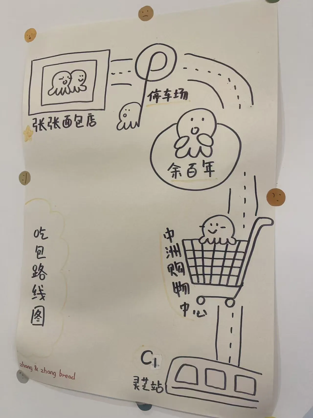
On a stormy afternoon, Rosa walked into a small bakery for shelter and left with a whole collection in her pocket.
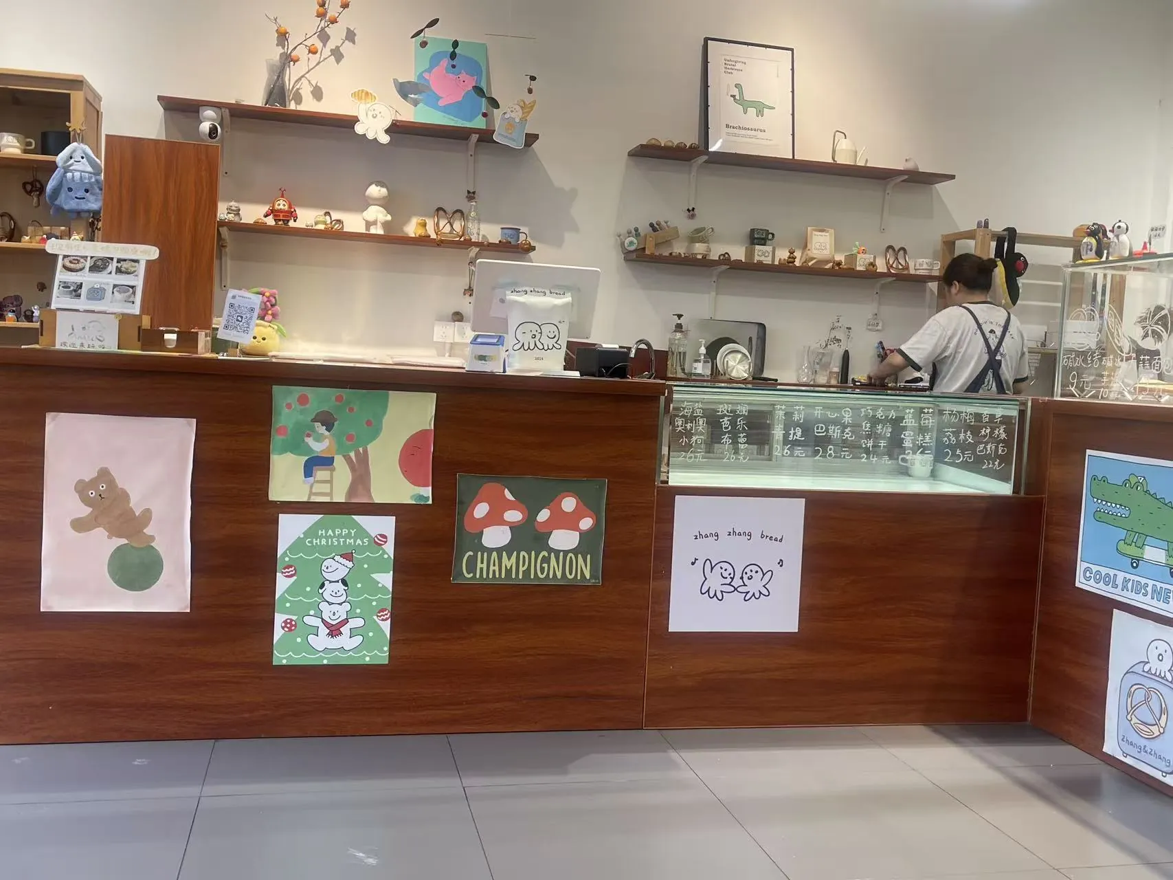
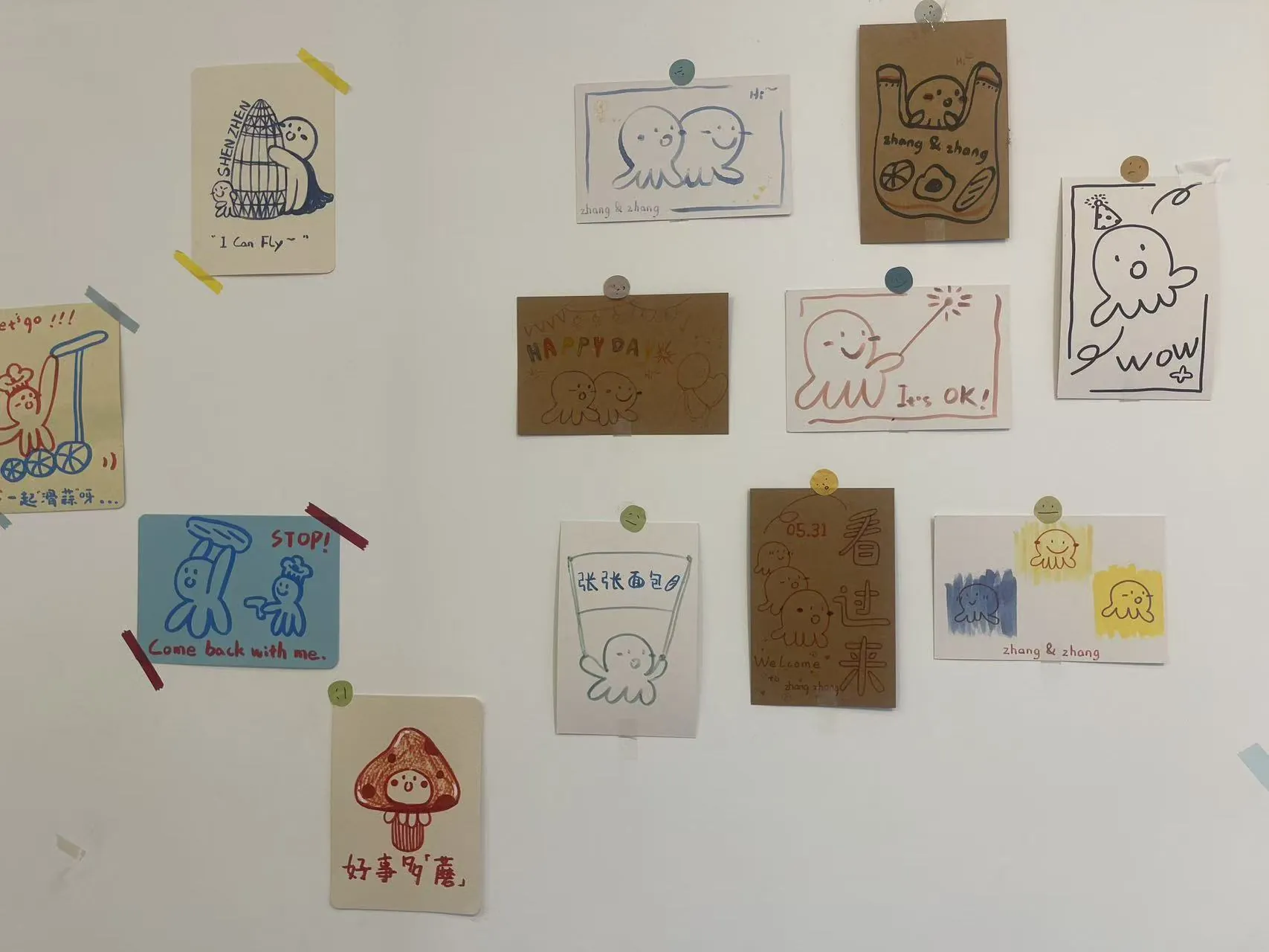
I am Rosa, a designer at LyraEdit. On a day of heavy rain, I stumbled into a neighborhood bakery that felt instantly different. The bread was surprisingly good, but what truly held me there was the place itself: hand-drawn posters taped to warm wood, funny little characters on the walls, a menu written with personality, and a shop owner who clearly believed that everyday details deserved charm.
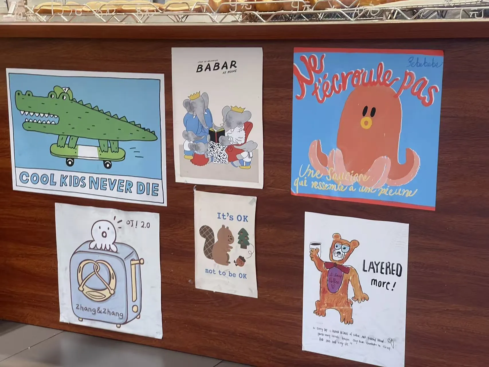
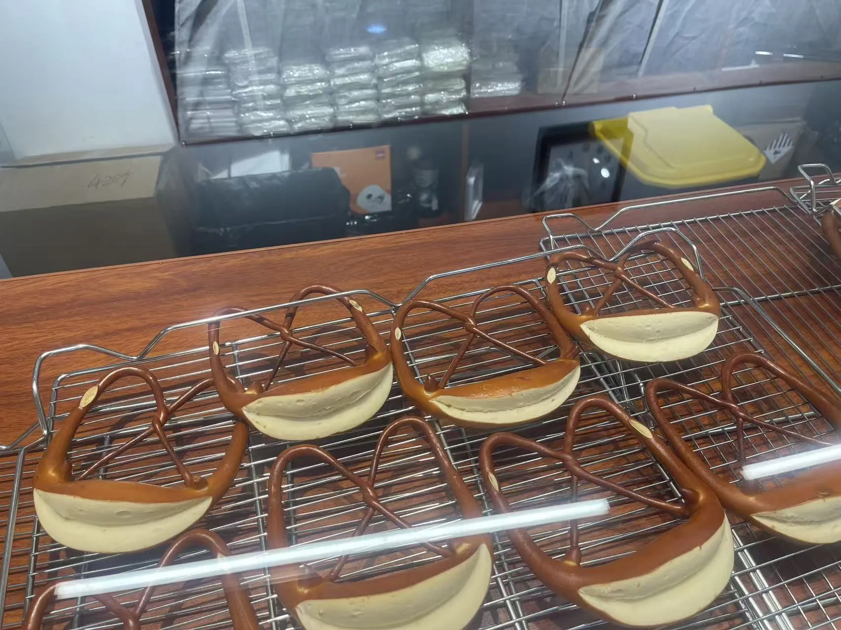
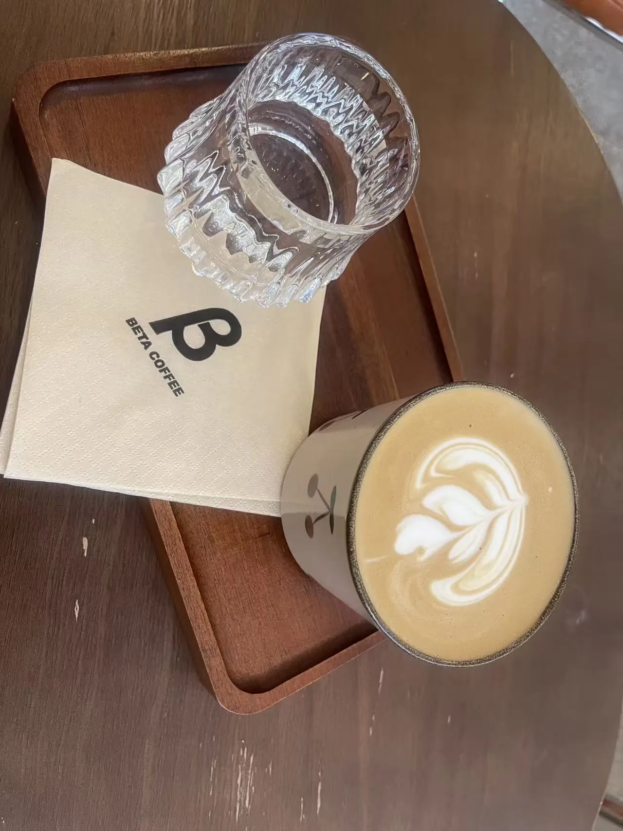
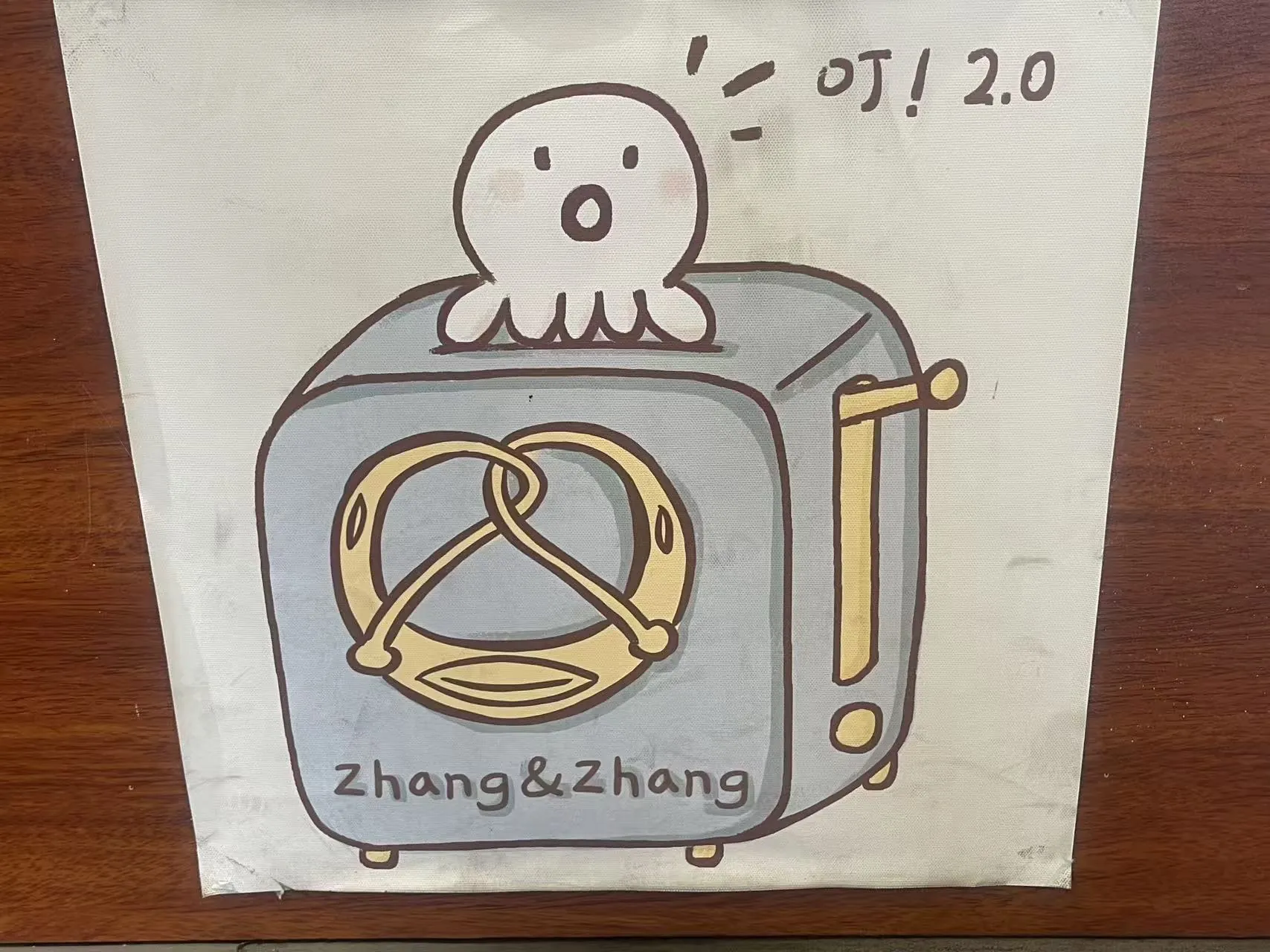
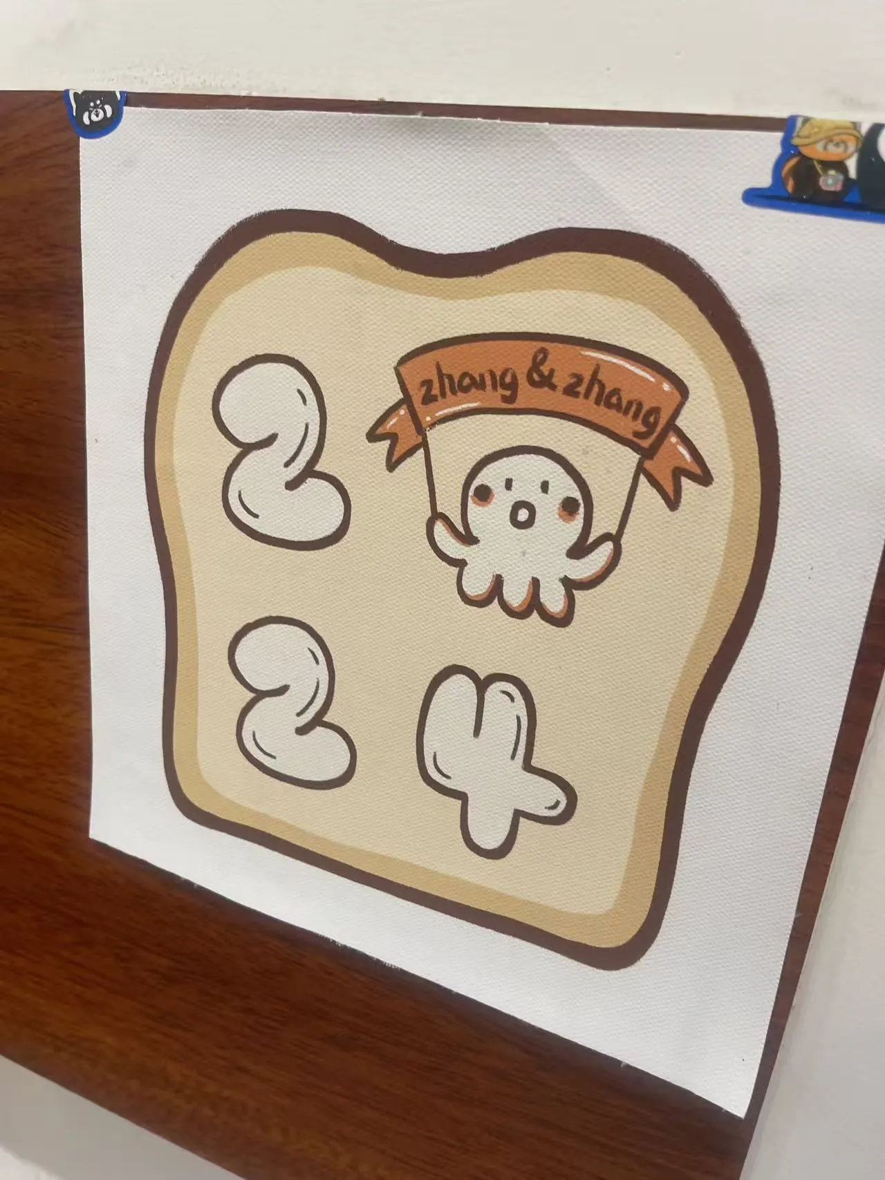
We talked for a while. I photographed pretzels behind glass, a coffee cup on a wooden tray, doodles of ghosts and toast, and one bright poster that read Cool Kids Never Die. It was not just a slogan. It felt like a small instruction: keep your curiosity intact, keep noticing, keep turning ordinary scenes into something with spirit.
Back at the studio, I translated the visit into nail art: bakery browns, milk-foam cream, rain-muted blues, butter yellow, soft pink, and the joyful looseness of marker drawings. The result is a four-piece series about finding inspiration before the rain even stops.
Nothing was polished. Everything had a pulse.
The drawings were not trying to be perfect. That was exactly why they worked. A crocodile on a skateboard, a toaster with a tiny ghost, sleepy bread shapes, happy mushrooms, handwritten maps, and a sign taped with the casual confidence of someone who makes things because they enjoy making them.
For the nail series, Rosa kept that hand-touched energy. The lines stay rounded and slightly naive. The color blocks are simple enough to read on short nails. The 3D details feel like soft bakery toppings, not heavy ornaments.
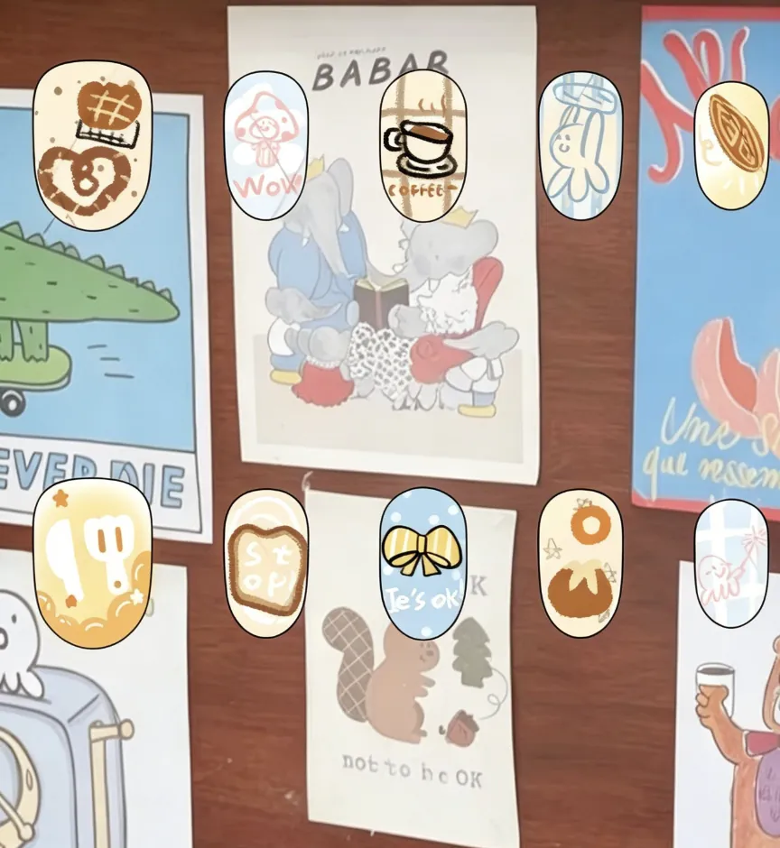
Rosa's bakery sketch, kept close to the original board.
This design sheet keeps the actual field-note composition from the bakery visit: cream bases, baby blue accents, caramel lines, toast, coffee, bows, soft spirits, and pastry-shaped details.
The warm cream panel keeps the page palette continuous. Flat decal details stay crisp, while selected motifs can later become raised gel accents: waffle texture, coffee rims, bow knots, cream drips, dots, and tiny stars.
Some press-on sets from one rainy afternoon.
Each product keeps the bakery's playful handwriting, then pushes it in a different direction: sweet, layered, graphic, or tactile.


Color story
Cream and caramel come from bread crust and coffee. Baby blue carries the rain and the wall posters. Butter yellow adds optimism. Pink appears only in small doses, like cheeks, stickers, and surprise.
Element evolution
Toast becomes a nail silhouette. Pretzel loops become raised gel lines. Coffee foam becomes glossy cream. Ghosts, mushrooms, bows, and crocodile energy become the playful language of the series.
Craft logic
Flat decals keep tiny drawings crisp on short nails. Raised clay gel is reserved for touchable moments: bow knots, waffle grids, cookie cheeks, cream drips, donut rings, and soft dotted sprinkles.
Look closely. A good day often starts as a small detail.
The bakery did not set out to become a nail collection. It simply made room for personality: a phrase, a drawing, a loaf, a conversation. That is the spirit Rosa wanted to pass on. Observe the beautiful things around you, and let them become a more inspired day.